Sunday 23 September 2012

William Eggleston


There is something truly gorgeous about Eggleston's images. His excellent use of angles make an everyday image look extraordinary. Out of the images I have seen, there is no sign of any human activity, making his images seem desolate and alien. I particularly admire his eye for angles however, and this is something I aim to improve in my own photography.

Martin Parr


There is something about Parr's work that is both charming and disgusting at the same time, and this is his ability to capture nothing but the naked truth. When I look at Parr's work, I find myself knowing the characters within them more than any other artist I know of; this is because they are real. Despite how engaging this is, there is something about his work that I find uncomfortable. I think that this is due to the garish colours used in his images. However, saying this, this is all part of the ugly truth, and without this Martin Parr would just be another photographer.


Robert Mapplethorpe 2


There is something about Mapplethorpe's photography of nude humans that seems even more naked than other nude photography. It is this difference that makes his work so much more fascinating. This could be due to how he doesn't strive to achieve the commercial sense of beauty; he instead focuses on the shapes and angles of the body. The way that the body fills the photo frame makes it clear that a lot of thought and passion has gone into his art.


Carrie Mae Weems


Carrie Mae Weems's selection of photographs around this kitchen table differentiated a lot from her other work for me. This was due to the normality of this scene, how different activities take place around a kitchen table. Despite this normality, each picture has a distinct sense of loneliness as there doesn't seem to be any communication taking place what is the center of the home. The plain decor of the kitchen with a simple low spotlight casts a harsh light on this loneliness and  adds to the empty feeling you get from the image.

Idris Khan

 
Idris Khan is a unique photographer due to his technique of layering different images on top of eachother to create an abstract blurring of lines of where one image ends and another begins. I found this particularly effective in this image as it appears he has layered images of buildings and humans. This makes the final piece eery as the viewer knows there are several human forms in the figure yet they can't fully distinguish them - almost like a hallucination. It is this slightly disturbing feel that I admire the most in this image.


Robert Mapplethorpe


I chose this image of Mapplethorpe's as even from this image you can see that Mapplethorpe is fascinated with the human form. He captures this even within his photography of flowers, reflecting curves and angles that are similiar to those found on a person. I found this more interesting than his photography of humans as the concept is more puzzling as the viewer considers what the flower resembles.

Friday 21 September 2012

Photography - Week 2 - Costume


Creating different costumes with limited supplies and props was very fun and entertaining. This forced us to be abstract with our ideas and not to strive for perfection; instead we created something more interesting.

Photography - Week 2 - Lights


This introduction was like nothing I had done before, so I enjoyed it as a new experience. I think the silhouette's outlines in different strengths of light and colours was my favourite outcome - it was the most striking and looked like something that could be used commercially such as advertising for a band.
Although drawing with light was interesting, it was very hard to be accurate and therefore I wasn't a fan of the outcomes - even though they were supposed to have lots of movement and energy in them. This could just be due to drawing human figures, maybe this effect would be best used when tracing another object.

Photography - Week 2 - Digital Photography


In this slide I concentrated mainly on capturing juxtapositions to make an interesting shot. I also attempted to capture a situation that makes the viewer curious as to what has happened. I enjoyed this project, I found myself looking at the scenery in a different way, wondering what would make an interesting shot. It was also challenging attempting to capture split second scenarios.

Thursday 20 September 2012

Sally Mann


Sally Mann's work is so fascinating that I found it difficult to choose one of her pieces to post. I chose this piece because the reasons I like her work is obvious within it: the combination of innocence and something dark and sinister. The way these siblings clasp hands should be heartwarming, yet something is terribly wrong, and it's not just one of the children's violent injury. The expression in the children's eyes is completely lifeless, as if neither of them notices the blood or that they are used to it. It is this lifeless expression that makes Sally Mann's work so absorbing. She expresses children in situations that would normally bring joy, either with indecent sexuality or with extreme loneliness. It is this element that leaves me trying to discover clues in the photograph as to what could have possibly made the children this way and that ultimately makes Sally Mann my favourite photographer so far.

Wolfgang Tillmans


From first glance, this photograph resembles a tree inside a tea cup - which of course captured my attention immediately. It took me some time to work out that the seemingly serene and beautiful tree inside a teacup was infact a layer of cracked mold. The impact of the realisation that something that I thought was beautiful was actually disgusting was brilliant, which is why I chose this photo. The ability to create this shock is genius, something that all photography should aim to do.

Sara Moon

 
Sara Moon's use of frayed paper and beige colouration gives her works a rich, vintage feel. When this is combined with the disturbing images such as this one, it it quite striking. The editing on the eyes that make them seem not human along with the bony, blurred silhouette of the hands makes this picture quite creepy. The intense stare at the hands, something we see everyday, increases the feel that the person in the photo is non-human. I like the questions this leaves in my head, making me wonder about it long after I've stopped looking at the photograph.

Corinne Day


Corinne Day's way of stripping down glamorous, often well known, models to their bare bones was very interesting. This almost overly natural view of the models with unbrushed hair, often naked and in dull, ugly rooms is extremely unique. This picture in particular caught my attention as Kate Moss is a famous model yet here she is in a plain jumper sat on a vulgar sofa - here she could just be anyone. 

Francesca Woodman

 
Francesca Woodman's photography captured my attention due to the way the models look completely unconcerned with their disturbing and grotesque situations. This picture in particular shows an average woman looking extremely uncomfortable, yet from the lack other objects in the picture and her blank stare into the camera makes this photo almost resemble a simple portrait. I  also like the grained appearance to her photo which adds to the effect of the picture being "normal".

Steven Klein


I really liked this image in particular of Steven Klein's as it combined glamour with horror extremely successfully. The beautiful female model casually smoking a cigarette juxtaposes completely with the gruesome appearance of the male model. As this is a scene that would normally cause panic and disgust, her serenity is disturbing. Also, the sensuous way she is touching his shoulder contrasts with how her hands are covered in his blood, making her appear savage and therefore more sinister. All of these contrasts and juxtapositions creates a curiosity in the viewer as to what exactly has happened here. It is this way of storytelling that captured my attention and made me choose this photo.
 

Illustration - Reflection

After completing the trial week of Illustration it is very clear to me that illustrators do a lot more observational drawings than I originally thought. I can see the benefit of doing this as you develop the ability to draw objects and figures more accurately from imagination which is important for illustration.
I can also now see that there are many different forms of illustration, not just in books; for example, illustration can be used in advertising and storyboards for films. This is important to me as I am considering illustration for a career and this widens the variety of jobs available in that specialism.
I would be particularly interested in illustrating storyboards for films (animations especially), and possibly having responsibilty for character design. 

Wednesday 19 September 2012

Illustration - Week 1 - Day 2

We began the day refreshing on the technique we had learnt in the previous lesson. On top of this we incorporated illustration by building our pieces around a set word, mine being "Soar". As we had decided on what things resembled this word before starting our pieces, I incorporated the themes of:
Pastel colours, flying, elegance, simple and movement.
 
 
To experiment with another illustration technique we created templates of the birds and cut them out of coloured paper. This created a block colour silhouette of the bird which looked quite nice in contrast with another colour. Although I wouldn't use this technique again, it was interesting to explore and I liked the composition of the end result.


Illustration - Week 1 - Day 1

We began this course by experimenting with different drawing and painting techniques to loosen us up and to broaden our perspective on how we should draw. To start off we attached pencils to the end of a long stick and shorter stick, and drew the birds infront of us holding onto the very end of the stick.


At first I thought I'd despise this exercise as I normally concentrate on minute details in pencil drawings and use tiny lines to create that detail; this technique took away that control completely, forcing me to create the birds using sweeping lines. Surprisingly though, I found myself really enjoying the freedom of this technique and the ability it gave me to go over mistakes with heavier lines and that it still looked good after this. I felt that the drawings at the end had much more character and were more interesting than if I had used my normal technique.
 
We then moved on to transferring this technique to ink, using the end of the sticks to apply the ink with.
 
I really liked the finished effect as it looked abstract yet captured the shape of the bird really well as this is what I focused on rather than detail. The drips and the build up of lines made this piece quite energetic and interesting to look at.
 
I really struggled to apply the technique to drawing this owl however. I think that this was due to the Owl having a definate pattern to his feathers; as I hadn't been including detail up to this point, it was really difficult to suddenly have to attempt to include it again. This resulted in the owl looking bare and unanimated.
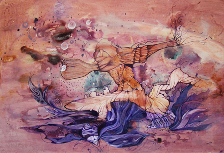
We finished the session by applying everything we'd learnt (media, technique, tools) to a final piece. I was very happy with this final piece as it contained the same loose, abstract feel by the build up of lines yet was more detailed by the slight use of tone.


Monday 17 September 2012

Es Tela a Cuadro


Cuadro's work is completely captivating for me. The dream like feel to the art stems from the artists fantastic combination of vibrant colours that sweep into each other due to her extensive use of patterns and lines. Even when the figures are completely abstract, you get the sense of movement due to the swirls of colours in the background or extensions of the figure. There is something both mysterious and beautiful about this work.


Wednesday 12 September 2012

Barandash Karandashich


Barandash creates these grotesque yet distinctively pitiful figures I find fascinating. He forms these figures by slashing ink across the page, creating either thin precise lines or bold cuts that give his illustrations a savage feel. I admire his technique greatly.
You can really tell from his work that he has spent hours on end observing and drawing humans. Despite the lack of features and obscure nature of his figures, he has captured human expression and body postures perfectly; this makes it easy for the observer to feel empathy for the creatures and become transfixed with his work.


Christian Bienefeld


This was an interesting idea, designing your own CD's simply with a marker pen.


Bienefeld has mastered the use of ink. I love the depth it gives to his pieces and yet how it also makes them slightly abstract. It darkens the mood of his works, which would be pretty images if another media was used. I particularly like the way he uses layers of ink to create shadows and tone.


Beth Emily


Emily's work captivated me immediately by how delicate and fragile her pieces look. The combination of watercolour, graphite pencil and digital media really presents the birds as stunning creatures. Her subtle use of a simple streak of colour on an otherwise simplistic graphite pencil drawing, attracts the attention back again and again - she is a new favourite of mine!


Nadeesha Godamunne


Godamunne's unique use of colours in what appears to be watercolour and inks is very inspiring. The abstract blending of colours that bleed into eachother and drip down off the page is beautiful - this really makes her pieces. It is this expressive use of colour that caught my eye and I'm sure will inspire future work.


Clarissa Paiva


I find Paiva's idea of painting over book pages very interesting, it adds another layer to the picture, making you curious as to why she's chosen to use this technique.

 
All of Paiva's work is minimalistic. This is due to the usual lack of background images using instead a paper wash, or in this instance, a border. The lack of colour draws attention instead to the eyes, which are the most detailed part of the paintings.

 
Paiva uses mainly pastel to colour her pieces, which is a media I haven't fully explored. Paiva has therefore inspired me to experiment with this media to attempt to achieve the same delicate effect she has.