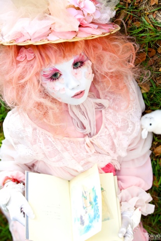
Processing Portraits
We have all seen hundreds of portraits in our life time, each slightly different, some so abstract they could hardly be counted as portraits. What is it that makes these portraits so different when so often they all have similar models?
“A real portrait is always more a portrait of the painter than of the painted” – Samuel Butler. Each artist has a slightly different style of painting, and some choose to use alternative medias to the classic oil or acrylic paints - it is this that is often the key to the varying nature of portraits.
Within this exhibition I am exploring several artists’ different takes on portraiture, revealing what it is that makes each one so distinctly unique; whether this is the media or the thought process that is behind each image, or both.
Medias used could be bizarre or simply household materials, both creating new and wonderful effects. For example Allison Corton's desire to use coloured dust to physically represent the morality of humanity, or Carne Griffith's use of ink, tea and vodka. Collaging too can be incredibly impressive, containing large amounts of symbolic meanings alongside the portraiture.
However the design of portraiture doesn't have to be symbolic or deeply thought out as shown by Zachary Welch who paints to music. Beginning with next to no plan as to where his portrait is going to end up, he creates images so complex and with such energy that it is equally as impressive.
Equally, portraits can be scientific as shown by ..., taking attractive women and combining their faces with x ray images to create repulsive but fascinating images.
With this exhibition, I wish to expel the yawns that one encounters when "portraits" are mentioned, moving away from the classical paintings of dukes and ladies and into the exciting experiments going on with portraiture in modern day.
Lee Jeffries
Jeffries photography focuses on the humanity that is often overlooked in homeless people. This is achieved through the harsh close ups that refuse to soften the reality of the situation these people have found themselves in, every dirt encrusted wrinkle, every scar is blaringly obvious to the viewer. What is most striking in the way Jeffries tackles these hard hitting portraits is the focus on the eyes –the part that most people avoid looking at when we see a person huddled in the street corner; they are inescapable, leaving the viewer with no choice but to notice the emotion and naked humanity reflected in those eyes – whether it be humour or sadness.
I have chosen to include Jeffries in this exhibition due to his very particular subject matter, enlightening everyone that looks upon his work, questioning our own reactions and behaviour towards the homeless. He highlights the cruelty of the human race as we overstep those that are worse off as if they were nothing but a speck of dirt, whereas Jeffries work reveals how these people are just like the rest of us. Each model in his picture is different, each is individual and obviously has an abundance of personality that shines in their eyes and reflects in their expressions.
Tim Flach
Flach is another photographer I have chosen to include in Processes of Portraits, although some might be confused as to why. As you can see, Flach’s models are animals, not humans as is expected of portraiture. However, Flach tackles animal photography in such an intimate way, allowing a lot of time for the animals to become comfortable around him so he can capture the most natural and expressive actions of the animals, that often the animals are seen as surprisingly human. Unintentionally, Flach creates a form of anthropomorphism within his images as we see animals apparently laugh, care for each other or simply stare into the camera with such intense emotion the similarities between them and humans is startling.
The process of having to create a comfortable environment for the animals and then to capture such humanistic characteristics is the reason why Flach is a perfect candidate for the exhibition – he has stretched and warped the meaning of Portraiture.
Buddy Nestor
Nestor starts out with what appears to be the “normal” portrait, always of an attractive woman, painted accurately and acceptably. So why is it that by the end of the process we end up with an extremely frightful image of the woman warped beyond recognition? Nestor explains that he is simply trying to capture the nature of humanity, but surely he was closer before the warping began? Nestor’s portraits are unlike any others in the way that he combines the actual image of the woman with what he describes as her “spiritual X-Rays”. What this entails is left open to interpretation, however the shapes and lines do share the appearance of an X-Ray laid on top of a picture.
To me, these images appear symbolic of how it doesn’t matter how attractive you are on the outside, everyone is the same on this inside; this is enforced with how Nestor only paints attractive women and an X-Ray is an internal image. As Nestor begins with an average portrait, it can’t be argued that these are portraits, yet the process after this is achieved makes these images particularly interesting and perfect for Processes of Portraiture.
Carne Griffiths
Griffith’s portraits are both simple and fantastic; combining human portraiture with flowers and vines in such a way that the two seem morphed into one beautiful, natural form. It is this combination that Griffiths creates in response to everyday images and situations, yet within his work physical boundaries are unimportant. In some of his images, these forms are simple and neat whilst in others they explode off the page in blotches of ink, yet somehow still capturing the beauty of the women and the flowers within the image. What I found most fascinating about Griffith’s work, and the main reason I included him in the exhibition, is his bizarre use of materials for media. By looking at these images, one would never guess that they were created simply using ink, tea and vodka.
These household items seems to add to the natural effect of his pieces, the way the medias run and bleed into each other, the way they are splashed onto the canvas to create an almost woody feel that reflects the organic images in the painting. This is portraiture where the artist commits completely to the mood and meanings they want to portray, down to even the materials used to create his work.
Allison Cortson
“A portrait, to be a work of art, neither must nor may resemble the sitter… one must paint its atmosphere” – Umberto Boccioni. Cortson takes this quote to the extreme. Whilst her images are lifelike and she paints the subject in as natural a pose as possible, often in the comfort of their own homes , Cortson also adds a little bit more of the model to the image.
The process of Cortson’s portraits takes place months before the actual painting begins; she begins in the homes of the model themselves. Spending time with the model, getting to know their habits, their character and … hoovering? Cortson spends months hoovering the subject’s house, collecting the dust that hovers on shelves, on the sofa, in the bed. She fills bags and bags with the model’s dust, and when the time comes, she sets about creating the portrait using the dust as others would use paint. The dust is used to create the environment in which the subject will be, literally, whilst the model is the only one painted in colour.
This use of the dead skin cells within the image makes the portrait extremely personal and also, Cortson states “represents something of a place in time”. This is ultimately true as the dust shows the changing state of the human, the skin living, the skin dying.
Zach Welch
Welch’s images are unlike any of the other portraits included in the exhibition in the sense that they appear more abstract, even more so than Carne Griffiths. The marks and colours are verging on being random, yet all fit together perfectly into his chaotic style that creates brilliant and beautiful women. The thing that makes Welch’s portraits really stand out is the energy that has clearly been etched into the image and I believe this stems massively from the process he goes through for each piece. Whilst many artists have a strict final idea of what they wish to achieve and know exactly how to get there, Welch is completely different. Starting with a vague plan of the layout of the piece, Welch begins work to punk rock music, literally seeing where the music will take him.
This freedom of painting and thorough enjoyment that goes into each of his pieces really shows and is the reason I have included him in Processes of Portraiture, his style described as “Street Art and Design with a hint of punk rock”.